

Colors & Theme
Zudoku provides flexible theming options allowing you to customize colors, import themes from shadcn registries, and add custom CSS. You can create cohesive light and dark mode experiences that match your brand.
Try out the interactive Theme Playground to experiment with colors and see real-time previews of your theme changes.
The theme system is built on shadcn/ui theming and Tailwind v4, giving us a great foundation to build upon:
- CSS variables match
shadcn/uiconventions - Tailwind v4 CSS variable system for modern styling
- Theme editors like tweakcn work out of the box
- Shadcn registries are supported
Custom Colors
You can manually define colors for both light and dark modes, either by extending the default theme or creating a completely custom theme. Colors can be specified as hex values, RGB, HSL, OKLCH, etc. - basically anything that is supported by Tailwind CSS:
Code
Available Theme Variables
| Variable | Description |
|---|---|
background | Main background color |
foreground | Main text color |
card | Card background color |
cardForeground | Card text color |
popover | Popover background color |
popoverForeground | Popover text color |
primary | Primary action color |
primaryForeground | Text color on primary backgrounds |
secondary | Secondary action color |
secondaryForeground | Text color on secondary backgrounds |
muted | Muted/subtle background color |
mutedForeground | Text color for muted elements |
accent | Accent color for highlights |
accentForeground | Text color on accent backgrounds |
destructive | Color for destructive actions |
destructiveForeground | Text color on destructive backgrounds |
border | Border color |
input | Input field border color |
ring | Focus ring color |
radius | Border radius value |
While shadcn/ui defines additional theme variables, Zudoku currently uses only these core variables.
shadcn Registry Integration
The easiest way to customize your theme is by using a Shadcn registry theme. For example you can use the great tweakcn visual theme editor.
Using tweakcn Themes
-
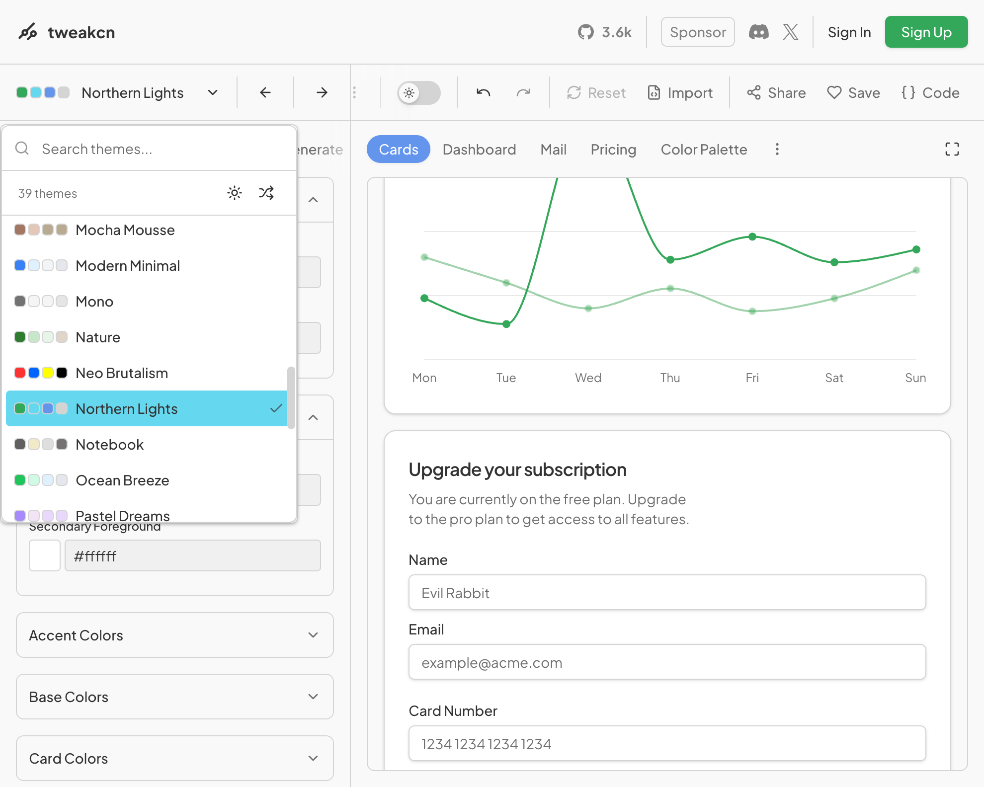
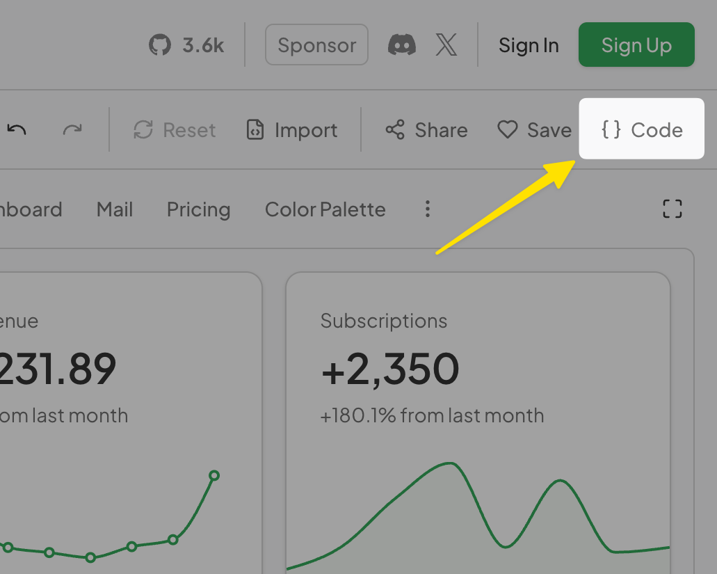
Visit tweakcn.com to select a preset or customize your theme visually
-
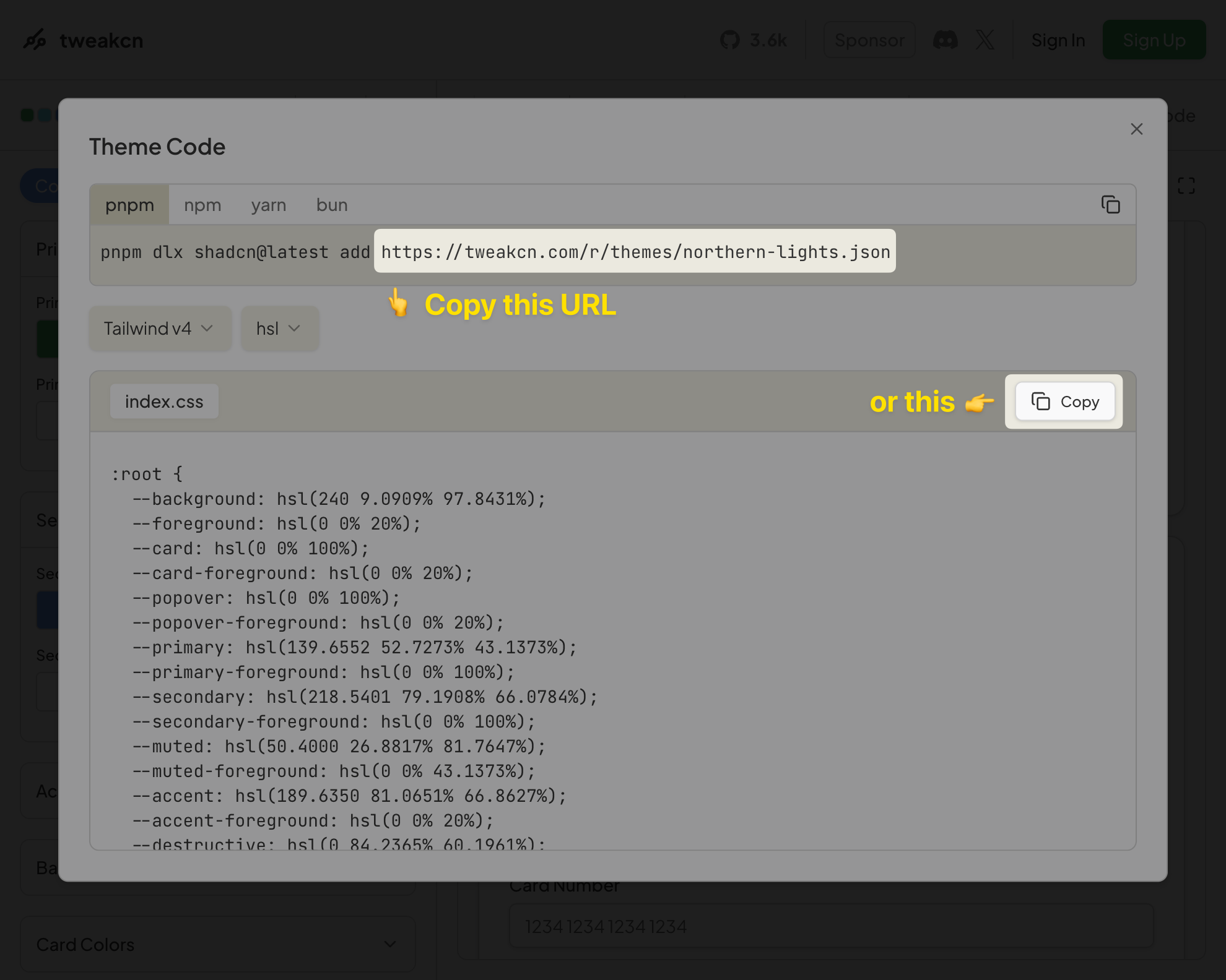
Copy the registry URL from the "Copy" section
-
Add it to your configuration:
Code -
The theme will then be automatically imported with all color variables, fonts, and styling configured for you 🚀
You can still override specific values if needed:
Code
Alternatively, paste the copied CSS into a stylesheet and import it from your config:
Code
Code
Custom CSS
The recommended way to add custom styles is to write a .css file alongside your config and import
it. This gives you HMR during development, syntax highlighting, autocompletion, and lets you split
styles across files as your site grows.
Code
Code
If TypeScript reports Cannot find module './styles.css', add zudoku/client to your tsconfig
types so CSS side-effect imports are recognized:
Code
Projects created with create-zudoku include this by default.
Inline alternatives (deprecated)
The theme.customCss option is deprecated and will be removed in a future release. It still accepts
a CSS string or object for backwards compatibility, but every change requires restarting the dev
server and you lose syntax highlighting, autocompletion, and HMR. Migrate to an imported .css
file.
Code
Enabling Code Ligatures
Zudoku disables ligatures in code blocks by default to avoid unwanted glyph joining in fonts like
Geist Mono (e.g. ---, ###, |--|). If you're using a coding font designed around ligatures
(Fira Code, JetBrains Mono, etc.), re-enable them in your CSS file:
Code
Default Theme
Zudoku comes with a built-in default theme based on shadcn/ui zinc base colors. If you want to start completely from scratch without any default styling, you can disable the default theme:
Code
When noDefaultTheme is set to true, no default colors or styling will be applied, giving you
complete control over your theme. Changing this requires to restart the development server.
Complete Example
Here's a comprehensive example combining multiple theming approaches:
Code
This configuration imports a base theme, customizes colors for both light and dark modes, sets fonts, and adds custom component styling.